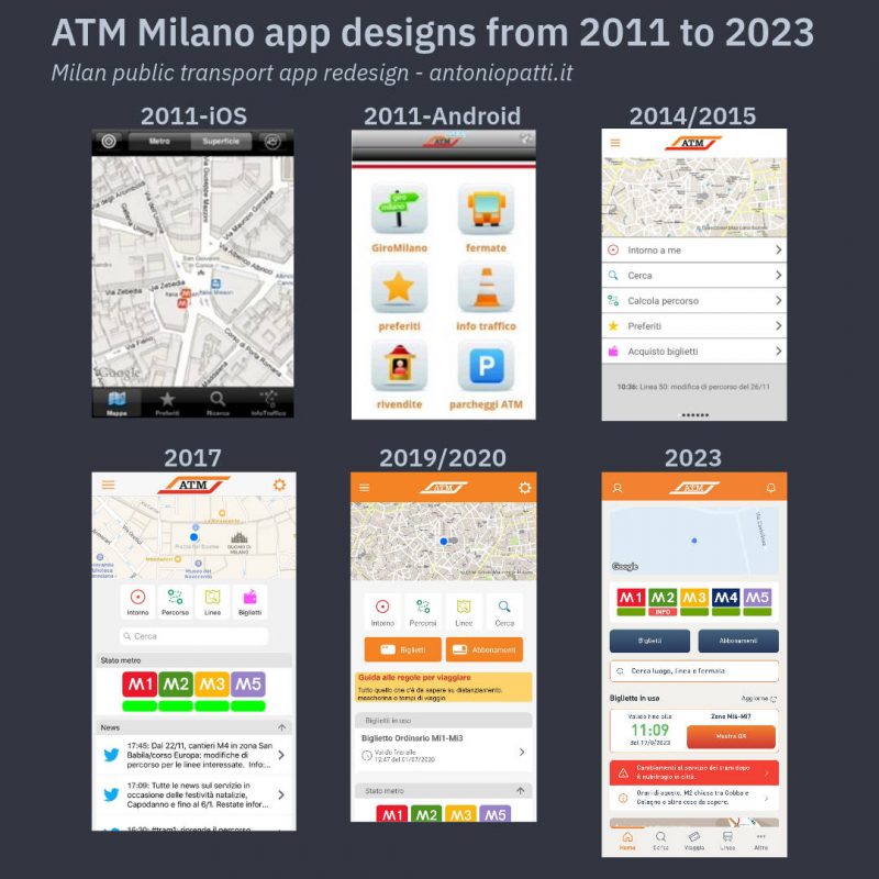
I have been working at Azienda Trasporti Milanesi (Milan Public Transportation Company) since 2008 and over these years, I have been involved in almost all the B2C digital products. The ATM Milano app is the project I loved more because I have been the Product Manger Lead since its inception in 2011 until its 2023 redesign.
The latest version is very important to me as it concludes the product lifecycle, and because it represents a significant professional and personal achievement that I want to share with colleagues from other transportation companies and product managers.
What does the app do in 2023?
The ATM Milano app serves as the go-to application for regular users of local public transportation in Milan and its surrounding areas. The users experience is centered around an home page that aggregates all the essential information and functions required for utilizing the public transportation service.
The app redesign
The objective of the redesign was to maintain and enhance all the functionalities highlighting real-time information and ticketing. For the project we didn’t modify the legacy back-end and we didn’t disrupt the user experience. The timeframe we allocated was 4/6 months, and following you can read a list of what we achieved together with the agency Engitel:
- New Information Architecture and a bottom navigation bar
- New UI based on a new Design System
- New features implementation using differently the legacy back-end
- Development and testing of a new Flutter based front-end
- Notifications efficiency improvement
Bottom and persistent navigation
The new bottom navigation is one of the most significant and needed changes to the app. Today navigating between the most used functions is much simpler and also persistent (sorry for the Italian only video).
The persistent navigation is a requirement I provided to the agency to prevent the menu from disappearing while using the main functions. In “Journey” and “Lines” for example, even navigating deep the tabs are always visible allowing users to go back to the main page of the function or navigating to other sections.
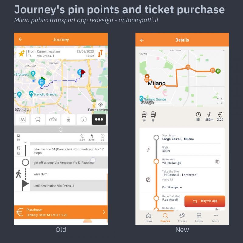
Maps and journeys
The “Search” section is dedicated to map’s geolocation an journeys. Here we have adopted the drawer-style menu format from Google Maps, but we have also kept the “Journey” function highly visible for the classic departure and arrival selection.
Despite almost all transportation apps relegate the creation of the journey after the search (the misunderstandable “Where do you want to go“), I believe that public transportation users habits are different and much simpler. Those who use buses, trams, and subways plan their trips in advance and not always the starting point coincide with “My Location”. The Google Maps interaction pattern moreover is designed to promote real-time exploration and advertising, but a portion of public transportation users simply want to know in advance what to catch to get from point A to point B regardless of where they are at the time of the search. Here are the two versions of the route calculation available in the redesign.
Improvements to be made: in the map itinerary, I would like to explicit the direction of the journey to easily differentiate the departure from the destination. In the meantime we changed the pinpoint icons using a checkered flag for the destination. This should be clearer than the old red flag. We added even a visibile a sticky button for the ticket purchase instead of leaving it at the end of the itinerary.
Improved search
“Search” is a legacy service that has been significantly enhanced thanks to the new Flutter front-end. Search results are now well organized in categories and surface stops now display both line number and vehicle direction. Additionally all the the lines are now included in the search using textual or numeric queries.
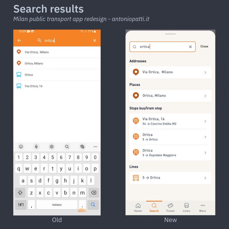
Improvements to be made: searches started in the home page should be completed in the same page. Sometime users that tap the “Close” button could not understand why they are in the “Search” section because the keyboard inhibits the bottom menu persistence (see above).
Lines and reverse direction
“Lines” section is one of the most frequently used function not only to understand the route of a vehicle, but also as searching tool for one or more stops of interest. We have significantly improved the understanding of line directions and we have also added an icon indicating the service changes.
In the same section, we have also included the static maps area useful for metro map, tariff zones, night lines and parking areas. On the surface line detail page, we have also added the useful reverse direction function and the connections with other lines.
Improvements to be made: add arrows that clearly indicate the direction of the line’s route and increase the size of the pinpoints on the map. It is also necessary to find a clearer solution to show the alternative paths.
Stop page and See on line feature
The surface stops detail pages now show the bus destination, and we have also introduced the new ‘”See on Line” feature. This function is used to locate the stop inside the bus route and see any other lines that pass through the same stop.
Tickets and Passes
Due to space constraints on the bottom menu, we decided to group together the functionalities of ticket purchase/validation and passes renewal. Conceptually, we have aggregated them under the verb “Travel” which represents the action that brings together occasional and habitual users.
The redesigned ticket purchase function is now visible to anonymous users and clearly displays types, time limits, and geographical restrictions of the most commonly used tickets.
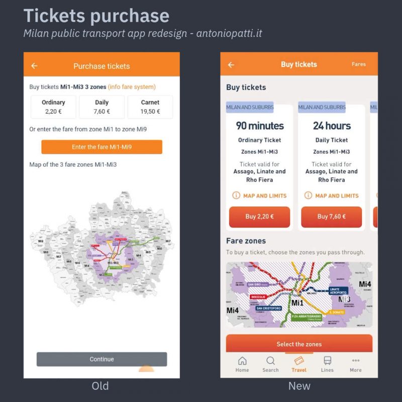
Fare creation selecting zones from Mi1 to Mi9 is now managed by a single element that retains the logic of the old app, enriched by a stepper that guides users through the purchase process.
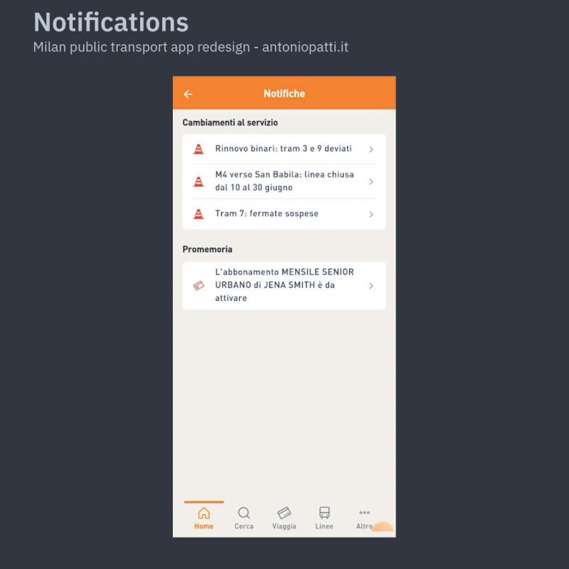
Notifications
The new notifications area collects lines service changes of the stops that are saved among favorites. The section collects even the important passes and travel cards expiration reminders (sorry for the Italian only screenshot).
More, Favorites and everything else
The new “More” section is a container where we gathered all secondary functions and also included external links to the corporate website or other services not managed within the app.
I am particularly happy with the favorite sorting feature where we even deliberately avoided imposing the categorization of addresses like “Home” and “Work. I find much usable to let users decide the addresses names. For example commuters arriving from areas not covered by local transportation or those without a fixed office may not find the predefined categorization suitable.
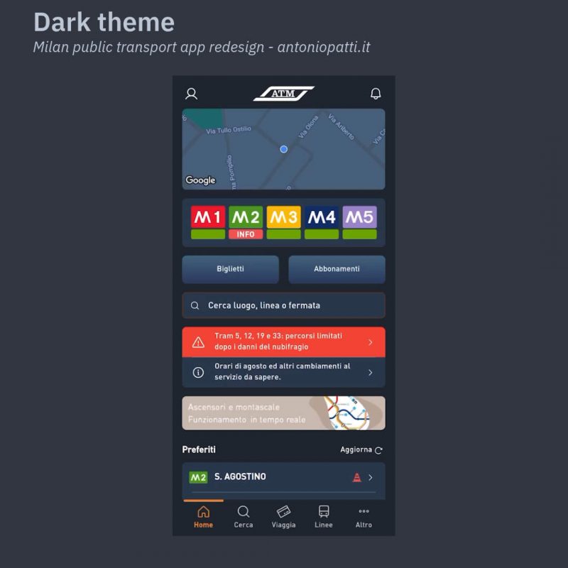
Dark theme
We have also included the dark theme that could seem trivial,but I believe that for some users it can be decisive in choosing whether using the app or not.
The function explicitation
User-centered design is a must, but adapting the function design to the entire potential audience of the app is not. I often have heated discussions with colleagues and external agencies about the choice of an icon or a text. For me indeed universally understood icons do not exist and isn’t true that in 2023 everyone knows smartphone user experience patterns.
Apps, especially those for public services, must be usable long before being nice. Therefore, I have aimed to make functions explicit avoiding hiding them behind simple icons. For this reason there is a “Calculate the route” instead of a snake like icon, or an “Add to favorites” instead of the star of Bethlehem, and a “See on Line” instead of some other inscrutable image representing a map.
Conclusions
Considering the deadlines and resources invested, I am genuinely satisfied with the redesign which I consider one of the most successful projects of my career.
I am happy to be able to have such a comprehensive retrospective of the Azienda Trasporti Milanesi app which evolved steadily and coherently over the years.
Digital products are made of ideas, strategy, financial resources, and technology but then they are used by people who have real needs, opinions, and problems to solve. The task of a Product Manager like me is to create the best possible product for the company and its users, making the most of the available resources. We must therefore ensure that all colleagues and stakeholders are involved and satisfied, without ever giving up on the strategy and general objectives of the project.
In public companies, digital products have even greater importance because they directly influence the quality of citizens lives and the efficiency of the national system.
Throughout these years, I have always given my best and I hope that this project will be the beginning of new challenges to improve the city and the lives of its residents.
Thank you, Milan.
Lascia un commento